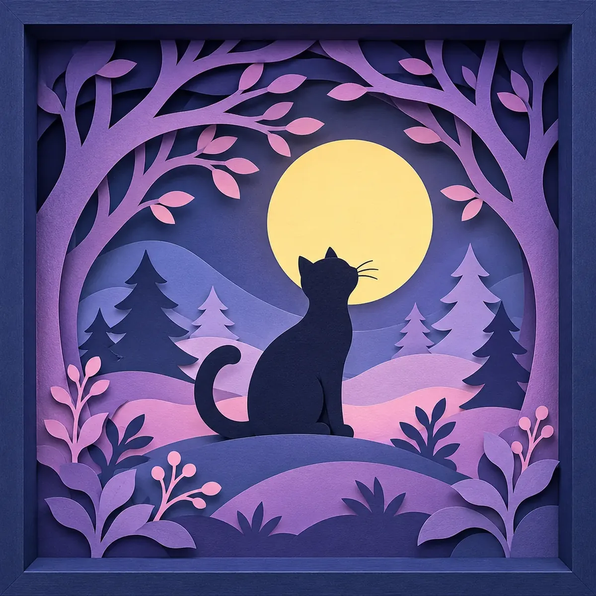
Two shadow boxes can share the same image, cardstock and layer count, yet one feels flat while the other looks like a tiny world. The difference is design: composition, color, negative space and depth working together.
Start With One Clear Focal Point
- Make the main subject visually prominent.
- Use surrounding shapes to guide the eye toward it.
- Reserve strong contrast for the areas you want to emphasize.
- Avoid giving every corner the same amount of detail.
Quick test: shrink your design to a thumbnail. If the focal subject disappears, simplify the surrounding shapes.
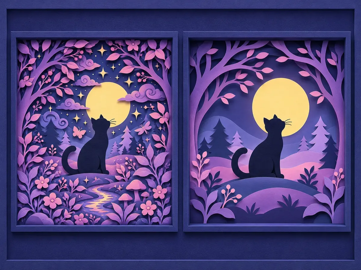
Think in Foreground, Middle Ground, and Background
- Background: calm shapes such as sky, moon, or distant mountains.
- Middle ground: supporting scenery such as trees, buildings, clouds, and hills.
- Foreground: closer silhouettes, decorative branches, grass, or a frame-like opening.
A foreground arch or branch can make the viewer feel as if they are looking into a miniature world. Keep enough breathing room around the subject so the framing feels intentional rather than crowded.
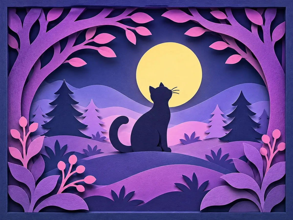
Choose Colors for Contrast, Not Just Decoration
- Choose enough value contrast between neighboring layers that need visible edges.
- Keep the focal subject distinct from its surroundings.
- Use a limited, coordinated palette rather than adding colors without purpose.
A dark foreground against a pale sky can create strong depth, but a light subject against a dark background can work just as well. There is no requirement for colors to become progressively darker toward the front.
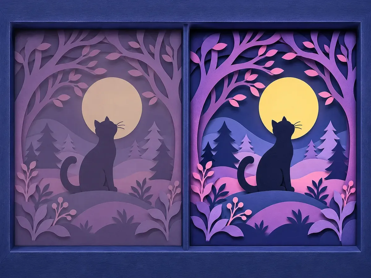
Quick test: preview the artwork in grayscale. If important shapes merge, adjust their relative lightness.
Use Negative Space as Part of the Design
- Leave open sky around a moon or a silhouette.
- Keep the subject separated from nearby branches.
- Use broad calm shapes behind detailed foreground elements.
- Avoid pushing critical details beneath the lip of the frame.
Editing exercise: remove one decorative element before adding another. Often the simpler composition feels more polished.
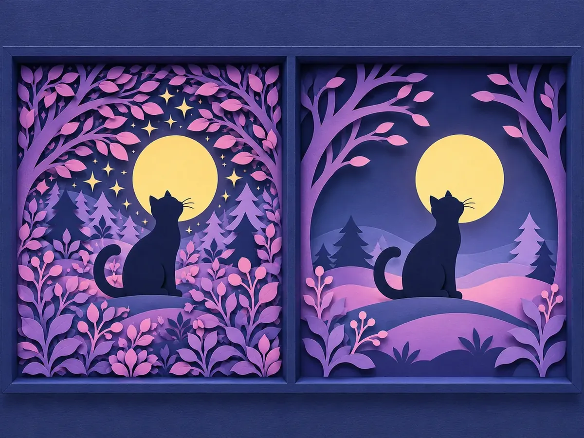
Overlap Shapes to Make Depth Feel Natural
- Stagger important contours instead of aligning them.
- Let foreground shapes partially hide objects behind them.
- Vary the size and position of repeated forms.
- Keep the main subject visible enough to recognize.
Useful rule: each visible layer should contribute to the composition, not merely repeat the previous layer’s outline.
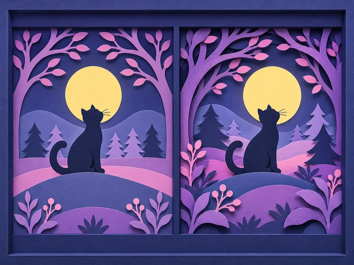
Choose the Number of Layers With a Purpose
| Layer count | Typical use |
|---|---|
| 4 to 6 | Bold silhouettes, simple scenes, approachable gifts |
| 7 to 10 | More detailed landscapes and several distinct depth transitions |
| 10+ | Complex compositions where the extra sheets have a clear purpose |
These are starting points, not strict standards. Multiple sheets can use the same color. Before adding another layer, ask whether it improves silhouette, depth, or composition.
Simplify Details and Design for Real Paper
- Enlarge important details that would otherwise disappear.
- Replace clusters of tiny cuts with stronger silhouettes.
- Avoid long, narrow connectors that might tear or curl.
- Keep critical features clear of the area hidden by the frame lip.
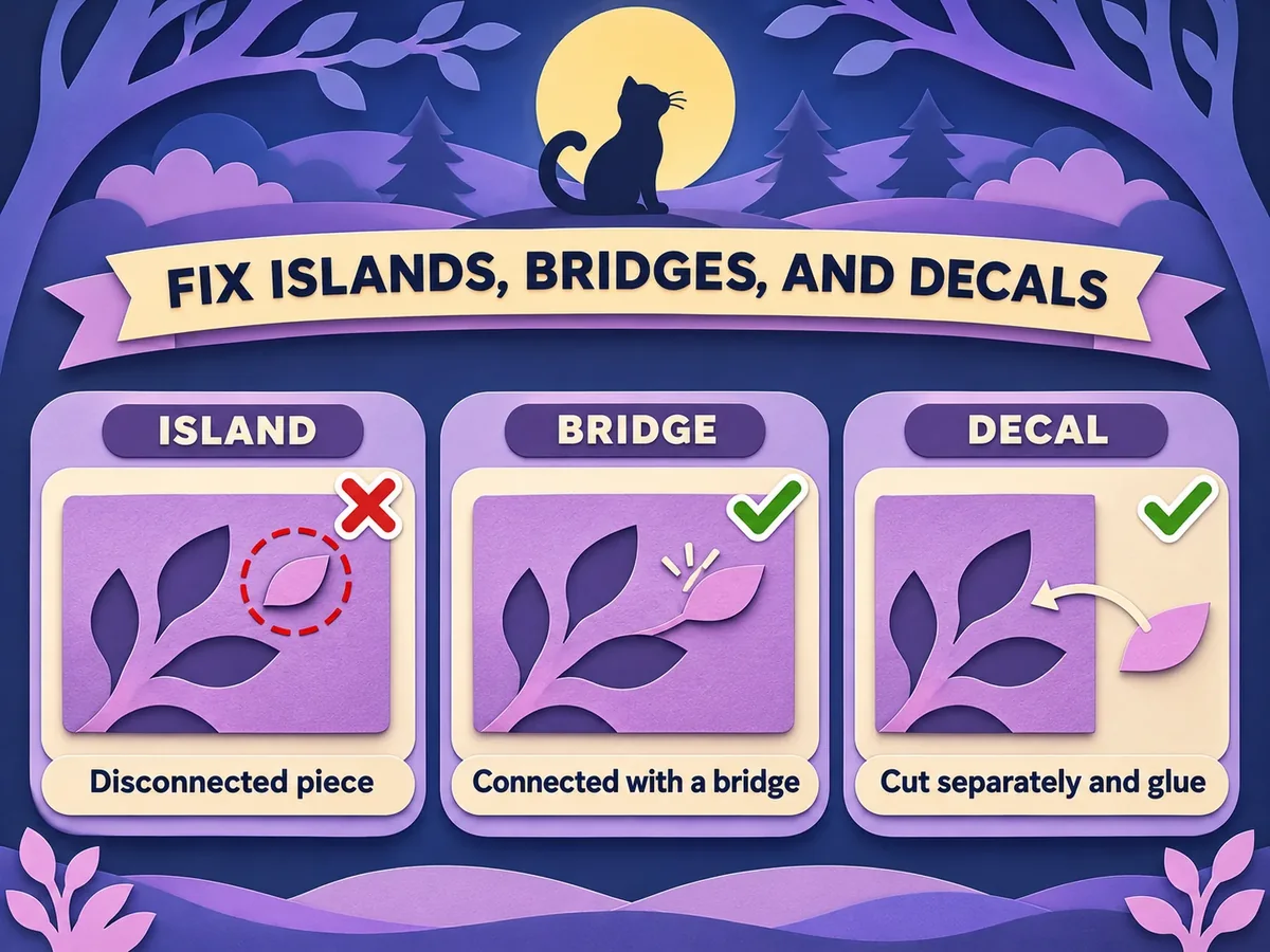
Watch for islands: disconnected pieces that have no structural attachment to the surrounding sheet. You can connect them with a small paper bridge, support them from another layer, or intentionally cut and glue them as separate decals. A bridge and a decal are different construction methods.
For practical fixes, read Islands and Bridges in a Layered SVG.
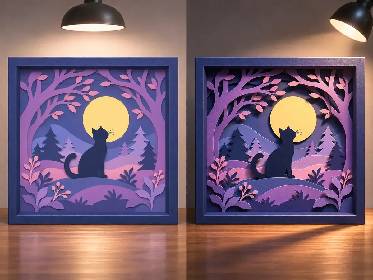
Use Layer Spacing and Light to Reveal Depth
- Spacing: wider gaps can emphasize depth, but take more room inside the frame.
- Direction: side or angled lighting often creates more visible edge shadows than frontal lighting.
- Cardstock: stiffer sheets tend to remain flatter and keep gaps more consistent. Around 80 to 100 lb cardstock is a good starting range.
- Frame clearance: make sure the stack fits without crushing spacers or artwork.
Soft ambient light can still work well when the silhouette and color design are strong. For materials and construction, see the Shadow Box Material Guide.
Preview the Complete Design Before Cutting
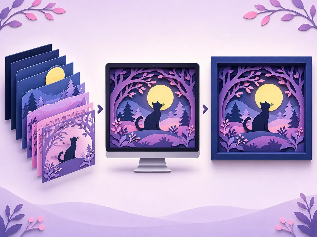
You can use KerfPress to generate or edit layered SVG artwork and inspect the composition in a 3D preview. Adjust colors, layer arrangement, and visual spacing before downloading the cutting files. Preview settings are a simulation; actual cardstock, spacers, and lighting determine the physical result.
Composing from separate SVG pieces? See how to combine SVG elements into one shadow box. Starting from your own drawing or an AI image? See drawing to layered shadow box and AI images you can cut.
If you are starting from a photograph, see How to Simplify a Photo into a Layered Shadow Box SVG.
Looking for Ideas?
Browse the template gallery for design inspiration.
Editorial illustrations are conceptual design examples, not guaranteed machine-ready cutting templates. Check bridges, unsupported islands, dimensions, and material tolerances before cutting.