Already have an SVG from an AI vector tool such as Recraft? That is a different job, covered in how to turn an external AI SVG into a shadow box.
Why most AI images can't be cut
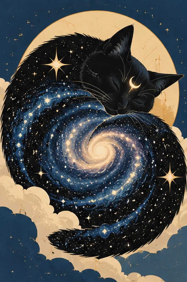
Every color in a layered papercut becomes a sheet of cardstock, and every edge becomes a cut. A typical AI picture is built from smooth shading and texture, so a layer generator has to guess where one color ends and the next begins. You get muddy averaged colors, thin strips that tear and floating bits with nothing holding them.
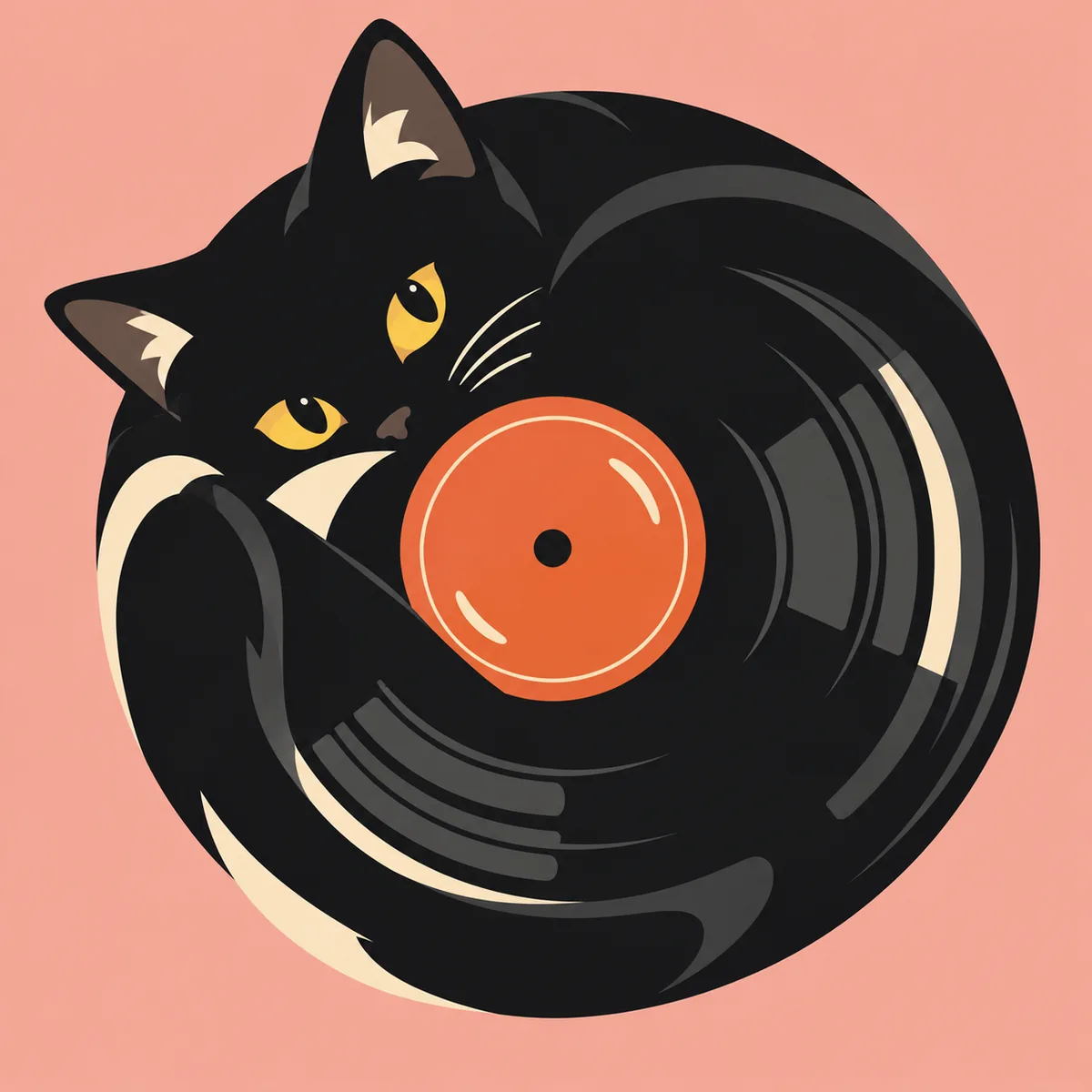
What cuts well looks more like a screen print or a paper collage: a few solid colors, big shapes, clean edges and a subject you can recognize from its outline.
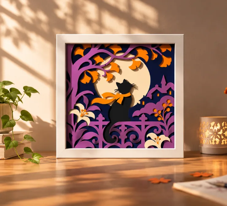
The first picture below is the kind to avoid. The second shows what to aim for.
What to ask for in your prompt
Write the prompt for the paper, not for the screen. If you write your own prompt, keep these in mind:
- Flat color blocks, no gradients, no shading, no texture.
- A limited palette, for example 4 to 6 colors. Name them if you already know your cardstock.
- One clear subject, large in the frame, with a bold silhouette.
- A simple background built from a few large shapes, such as sky, hills or a moon.
- Few small details. No sparkles, no fine hair, no thin lines.
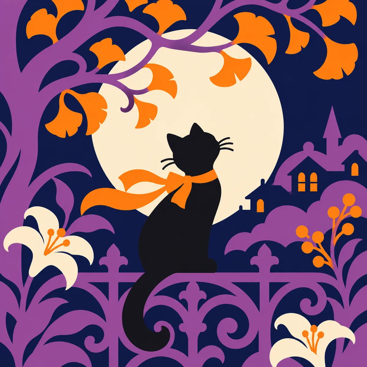
The prompt I used for the cat below
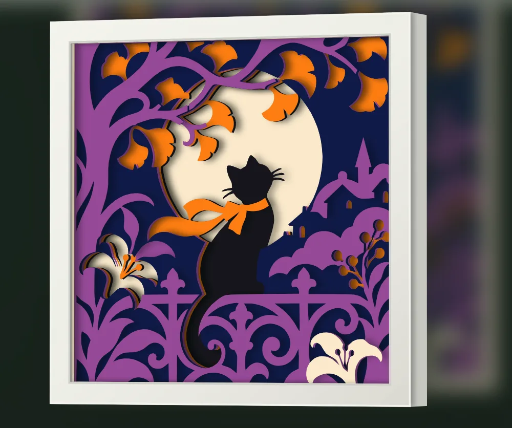
A black cat sitting gracefully on an ornate garden fence beneath an oversized glowing full moon, surrounded by elegantly curved tree branches, stylized autumn leaves, layered botanical silhouettes, and decorative wrought iron fence patterns.
Sophisticated flat vector illustration designed for a layered papercut shadow box, inspired by Art Nouveau poster design and contemporary editorial illustration.
Color palette: exactly 5 solid colors: deep midnight navy, rich violet purple, warm burnt orange, soft ivory cream, and pure black.
Composition: square 1:1 format, with the cat as the clear focal point, framed by an oversized moon and flowing botanical elements. Asymmetrical yet balanced, with a strong sense of visual rhythm, graceful curves, and intentional negative space.
Layering: 5 or 6 visually distinct overlapping depth planes, using contrasting solid color shapes to create depth without gradients or shading. Decorative details should be integrated into larger connected shapes.
Visual style: bold and expressive silhouettes, elegant organic curves, varied shape sizes, thoughtfully arranged decorative details, clean color boundaries, and a refined handcrafted aesthetic.
No gradients, no textures, no realistic lighting, no shadows, no 3D effects, no thin outlines, no photorealism, no tiny floating elements. Every color region should feel intentional and suitable for conversion into layered cut paper artwork.
Check the image before you generate
Step back from the screen and look at the picture small. Ask yourself:
- Can I still tell what it is from the silhouette alone?
- Does each large area use one solid color, not several similar shades?
- Are there tiny marks, dots or thin lines I'd hate to cut? Ask the AI to remove them.
- Does it look like a mosaic or low poly art? Then ask for something simpler.
If you're unsure, run it again with words like "simpler, bigger shapes, fewer colors". Two or three rounds is normal.
The same simplification idea for real photos is explained in how to simplify a photo into a layered shadow box SVG. For what makes a composition read well once it is stacked, see the guide to designing a layered shadow box.
Turn the image into layers
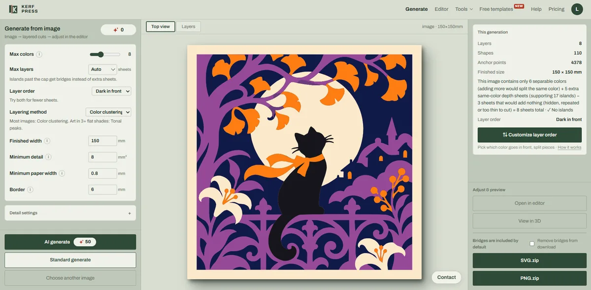
Download the image as PNG and open it in the KerfPress generator.
- Set the number of colors to the cardstock colors you plan to use. More colors give finer shading but mean more paper and more gluing.
- Start with color clustering as the layering method. It suits most AI art.
- Set the minimum paper width so thin strips stay strong enough to cut.
- Layer 01 is the back. Higher numbers sit closer to the front.
If the AI picture is still a little busy, the generator also has an AI generate option that cleans up the colors of a picture before it is cut, 50 points a run.
Check islands, bridges and depth
Before you download, look at the result summary. The generator adds bridges where it can and warns you if any islands remain. Open the result in the editor to move a bridge, add one by hand or turn a loose piece into a decal. Islands and bridges are explained in islands and bridges in a layered SVG.
Then open the 3D preview. If the cat and the moon blur into one, change a layer color or the layer order and look again.
Quick tips
- Name the number of colors in your prompt. AI tools love to add more.
- Ask for "no outlines". Black outlines become thin strips that tear.
- Ask for a plain border area around the subject. Every sheet needs an uncut edge for the frame to hold.
- Keep eyes and small features large, or plan them as decals.
- Cut a small test first on your real cardstock.
Drawing your own art instead? See how to turn your own drawing into a layered paper shadow box. New to shadow boxes? Start with the full walkthrough.